


Planning Color Before Book Production
Color reproduction in children’s books depends on more than the artwork displayed on a computer screen. File setup, paper surface, ink coverage, proofing method, printing process and finishing all affect the final appearance.
Pagebrio Printing supports full-color children’s books produced from approved CMYK files. Pantone spot colors can also be reviewed when a project requires a defined brand color, solid-color area or specific cover treatment.
Before quotation and proofing, buyers should identify the book type, paper, quantity, color requirements and any physical reference that must be considered. Artwork requiring close color control should be reviewed before CTP plate making and bulk production.
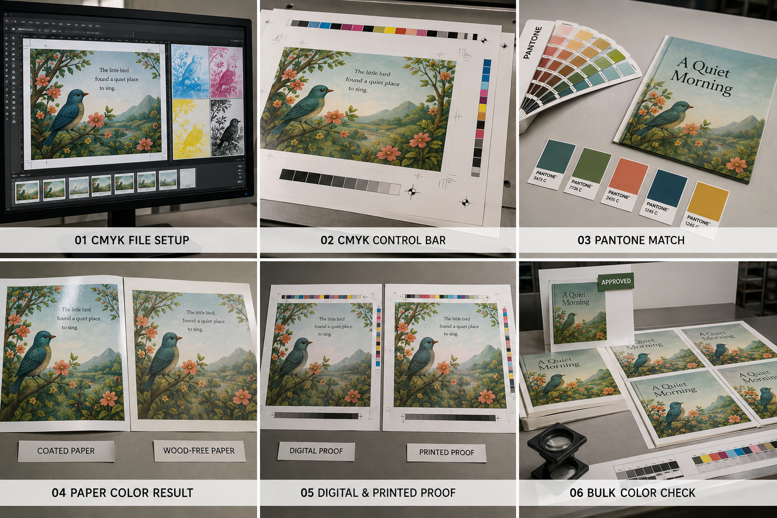 CMYK Printing for Illustrated Books
CMYK is the standard process-color method for full-color picture books, board books, educational books, photo books and comic books. Cyan, magenta, yellow and black inks are combined to reproduce illustrations, photographs and gradients.
Artwork should be prepared in the intended CMYK color space before final approval. RGB images can appear brighter on a backlit monitor, particularly in highly saturated blue, green and orange areas. Converting the file late in the process may result in unexpected changes.
During prepress review, we check image resolution, color mode, black settings, overprint-related issues and the separation of special finishing layers. File requirements should be confirmed through Artwork, Size & Page Setup before the project enters proofing.
Pantone and Defined Spot Colors
Pantone colors can be considered when a project requires a more clearly defined solid color than a standard CMYK build can provide. Typical applications include:
- Publisher or brand colors
- Solid-color covers
- Logos and graphic elements
- Selected educational products
- Foil, spot UV or other registered finishing areas
A Pantone reference should be identified by the buyer before files are finalized. The appearance of a spot color can still vary according to paper whiteness, surface, absorption and finishing.
Pantone printing may add plate, ink and setup requirements. These factors can affect sample cost, MOQ and production time, so spot colors should not be added after the quotation has been confirmed.
Paper Surface and Color Appearance
The same artwork can appear different on coated and uncoated materials. Coated art paper normally supports sharper details and stronger color density because the ink remains closer to the surface. Wood-free uncoated paper absorbs ink differently and often produces a softer, less saturated result.
Board, kraft and specialty materials can also influence color through their base shade and surface texture. White ink or other non-standard processes should only be discussed when technically necessary and confirmed as feasible for the selected material.
Paper should therefore be selected before final color approval. Buyers can review how GSM, opacity and surface influence the finished book under Paper & Board Options.
Digital Proofs and Physical Printed Samples
Digital proofs are useful for checking page content, image placement and general color relationships. They normally take approximately 2–4 working days. However, a digital proof may use a different printing process and paper from the final offset production.
A physical printed sample is recommended when:
- Illustration color is commercially important
- Paper surface must be confirmed
- Pantone colors are specified
- Dark or highly saturated images are used
- Cover and interior colors must coordinate
- Lamination or special finishing affects appearance
Standard physical samples normally take approximately 5–10 working days. Complex structures or multiple finishing processes may require longer. Available proof methods are explained on the Proofing & Sample Approval page.
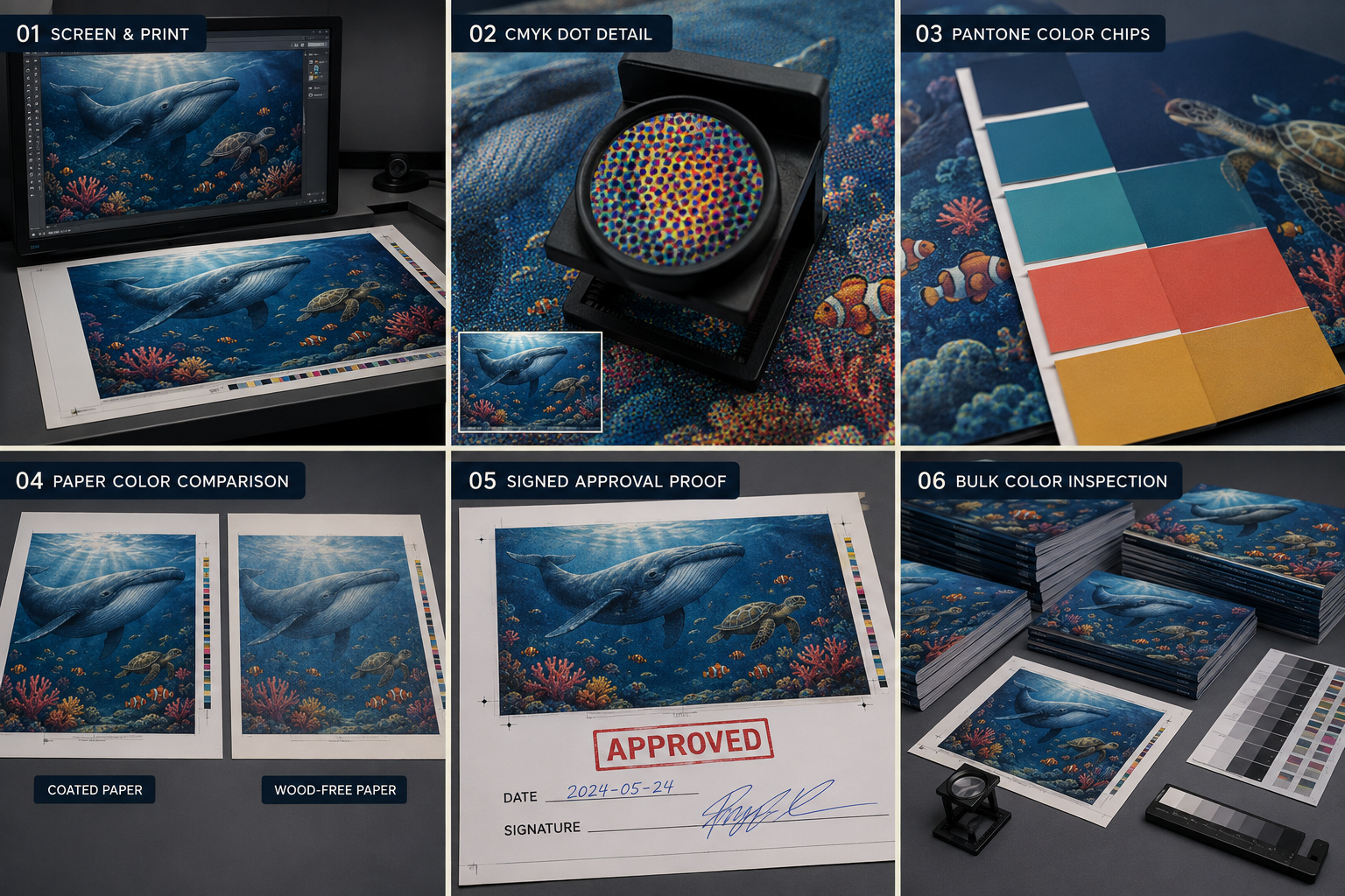 Color Control During Bulk Printing
The approved file, color reference and physical sample provide the basis for production. Printing checks can include:
- Color bars and density
- Registration
- Neutral gray balance
- Solid-color consistency
- Fine illustration details
- Dark-area detail
- Marks, smudging or uneven ink
- Comparison with the approved reference
A screen image cannot serve as the only production standard because monitor calibration, brightness and viewing conditions vary. When exact visual expectations are important, the buyer should provide an approved printed reference or confirm a physical sample.
Normal industrial printing tolerances should also be considered. We control production against the approved standard, but it is not realistic to promise that every printed sheet or every repeat order will be visually identical under all lighting conditions.
Finishing Effects on Printed Color
Gloss lamination can increase contrast and surface reflection, while matte lamination may create a softer appearance. Spot UV introduces selective gloss, and embossing or debossing changes how light falls across the printed area.
Foil stamping is a separate applied material rather than a printed CMYK color. Finishing positions should be supplied as separate artwork layers and checked against the approved cover file.
Color and finishing should be evaluated together when preparing a premium cover or image-led book.
Information Needed for Color Review
Please provide:
- Print-ready PDF files
- CMYK or Pantone requirements
- Selected paper or board
- Physical color reference, if available
- Cover and interior printing details
- Lamination and special finishing
- Quantity per title
- Required proofing method
- Target production and delivery date
These details allow us to evaluate file preparation, proofing, printing setup, MOQ, production time and the most suitable color-approval method.